
24 January, 2025
The Psychological Impact of Colour in Pen Branding
When it comes to branding and marketing, colours are not just aesthetic choices – they are powerful tools that can significantly influence consumer perception and behaviour. In the world of pen branding, where differentiation can be challenging, the strategic use of colour becomes crucial. Understanding the psychology behind colour choices can help brands create custom-printed pens that not only stand out visually but also resonate emotionally with their clients.
Understanding Colour Psychology
Each colour carries specific connotations and can evoke different emotional responses. Here's a look at common colour choices in pen branding and the psychological impact they may have:
1. Blue: Trust, Stability, and Professionalism
Variations of Blue: Different shades of blue can evoke various aspects of trust and professionalism. Lighter blues are often seen as calming and friendly, while darker blues convey depth, expertise, and strength.
Corporate Appeal: It is a dominant colour in the corporate world. It's widely used in pen branding for businesses, financial institutions, and legal firms, where trust and reliability are paramount.
Cross-Cultural Acceptance: It is generally well-received across different cultures, often associated with wisdom, confidence, and unity. This universal appeal makes blue a safe and effective choice for global brands.
2. Red: Energy, Passion, and Action
Stimulating Action: Red's ability to grab attention and provoke action makes red pens particularly effective for brands in fast-paced, energetic sectors. It's also great for promotional campaigns that aim to evoke excitement or highlight urgency.
Emotional Response: It can stimulate a strong emotional response, often associated with passion, strength, and love. This can be leveraged in branding to create a deep, visceral connection with the audience.
Cultural Significance: In some cultures, red is a symbol of good luck and prosperity, which can add an additional layer of meaning to red pens in these contexts.
3. Green: Growth, Harmony, and Stability
Eco-Friendly Message: Green is the hallmark of sustainability. Pens in various shades of green are often used by brands that promote environmental awareness, organic products, or have a strong ecological ethos.
Relaxing and Balancing: This colour is also calming and restorative, symbolising nature and renewal. This makes them a popular choice for wellness brands, spas, and health-oriented companies.
Shades and Nuances: Darker greens are associated with wealth and prestige, while lighter greens are seen as more peaceful and health-focused. This range allows brands to choose a shade that best fits their message and target audience.
4. Black: Elegance, Sophistication, and Power
Luxury and Exclusivity: Black pens often signify luxury and exclusivity. High-end brands use black to convey sophistication and timeless elegance in their pen designs.
Professionalism and Authority: In a professional context, they denote seriousness, authority, and decisiveness. They are popular in legal, academic, and high-level executive environments.
Versatility in Design: The versatility of this colour allows it to be combined with other colours or metallic accents (like gold or silver) to enhance the perception of luxury and value.
5. Yellow and Orange: Creativity, Optimism, and Enthusiasm
Youthful and Playful: Bright and warm hues like yellow and orange are often associated with fun, creativity, and playfulness. They are particularly appealing to younger demographics and creative industries.
Stimulating Creativity: These colours are thought to stimulate creativity and enthusiasm, making pens of these colours ideal for industries like advertising, design, and education.
Optimism and Approachability: They convey a sense of friendliness and optimism, making them suitable for consumer brands that want to appear accessible and positive.
6. Purple: Creativity, Luxury, and Wisdom
Symbolism: Purple traditionally symbolises royalty, luxury, and sophistication. It is also associated with creativity and imagination, making it a popular choice for brands that want to convey these qualities.
Shades and Meanings: Lighter shades like lavender can evoke feelings of calmness and spirituality, while deeper purples, such as violet, are often perceived as more luxurious and mysterious.
Target Audience: This colour is particularly appealing to artistic and innovative audiences, as well as luxury markets.

7. Pink: Playfulness, Compassion, and Femininity
Emotional Connection: Pink is often associated with playfulness, warmth, and compassion. It’s widely used to appeal to a youthful demographic and traditionally feminine markets.
Variations: Different shades of pink can communicate different messages - from soft pastel pinks that evoke a sense of gentleness and calm to bold, bright pinks that are energetic and fun.
Industry Application: Ideal for beauty and health products, children’s goods, and any brand aiming to project a gentle, nurturing image.
8. White: Simplicity, Purity, and Clarity
Clean and Modern: White is often associated with simplicity, cleanliness, and purity. It’s used in branding to convey a sense of clarity and straightforwardness.
Versatility: It can be paired with other colours to create a design that feels modern and minimalistic, often appealing to high-tech and luxury markets.
Universal Appeal: White pens can have a broad appeal, suitable for various industries and conveying a message of freshness and efficiency.
9. Grey: Neutrality, Professionalism, and Balance
Corporate Professionalism: Grey is perceived as neutral, balanced, and sophisticated. It’s a popular choice in corporate and professional environments, where it conveys a sense of stability and modesty.
Shades and Contexts: Lighter shades can be soft and approachable, while darker greys are more authoritative and strong. It can also be used as a base for highlighting other branding elements.
5. Gold and Silver: Affluence, Quality, and Prestige
Luxury and Elegance: Gold and silver are synonymous with wealth, affluence, and high quality. Pens in these colours, often combined with black or deep blue, are used to create an impression of elegance and exclusivity.
Special Occasions: Gold and silver pens are often chosen for commemorative editions, special events, or as executive gifts, conveying a sense of importance and prestige.
Target Markets: These colours appeal to high-end and luxury markets, where customers are looking for products that signify status and class.

The Cultural Significance of Colours and Their Application in Pen Branding
Colour preferences and associations can vary significantly across different cultures. Understanding these cultural nuances is vital for global brands, especially when selecting pen colours for international markets. Below are ten countries and how they perceive different colours and how these perceptions can influence pen branding strategies.
1. United States
Red, White, and Blue: These colours, reflecting the national flag, evoke feelings of patriotism and pride. Pens in these colours can be appealing around national holidays or political events.
Green: With a growing emphasis on sustainability, green is increasingly associated with eco-friendly and health-conscious products.
2. Japan
Red and White: These are traditional colours in Japan, symbolising happiness and purity. These colours can be well-received in the Japanese market, especially for occasions like weddings or New Year celebrations.
Black: In Japan, black signifies formality and sophistication, making black pens a popular choice for business and official use.
3. China
Red: Red is the colour of luck, happiness, and prosperity in Chinese culture. Red pens can be particularly popular during the Chinese New Year and other festive occasions.
Gold: Symbolising wealth and fortune, gold-coloured pens are well-suited for gifts and premium promotional items.
4. India
Saffron and Green: As important colours in the Indian flag, they represent courage and faith, so ones in these colours can resonate well with Indian nationalism.
White: Denoting peace and purity, this colour can be favourable, especially in a religious or spiritual context.

5. Germany
Black, Red, and Yellow: Reflecting the national flag, these colours can evoke a sense of national pride. Pens in these colours might be popular during national events or sports tournaments.
Green: With a strong environmental movement, green pens can symbolise sustainability, appealing to the eco-conscious market.
6. Brazil
Green and Yellow: As national colours, they are associated with Brazilian culture and festivity, making ones in these colours appealing for celebrations and sports events.
Blue: Often related to the beauty of the Brazilian coastline and sky, blue pens can be popular for their calming and serene associations.
7. United Arab Emirates
Green: A traditional colour representing prosperity and growth, pens in this colour can be well-received for their cultural significance.
White and Black: These colours, found in the national flag, can be used in pen branding to evoke a sense of national identity and unity.
8. Russia
Red: Historically significant, it can represent strength and revolution. Red pens can have a positive reception, especially for commemorating historical events.
Blue and White: Reflecting the Russian flag, these colours can be used to invoke feelings of national pride and loyalty.
9. South Africa
Green, Yellow, and Black: As colours of the South African flag, they represent the country’s diverse nature and rich history. These colours can be particularly appealing during national celebrations.
Red: Also present in the flag, it can symbolise sacrifice and passion, suitable for commemorative products.

10. Australia
Green and Gold: These are Australia’s national sports colours, representing the country’s landscape and wealth. Ones in these colours can be popular, especially during sports events.
Blue: Reflecting the ocean surrounding the continent, this colour can resonate with the Australian love for the coast and nature.
In international marketing, the choice of pen colour should consider cultural associations and preferences. Brands can leverage these insights to tailor their pen branding strategies to each country, ensuring that the colours chosen resonate with local customs, traditions, and values. By doing so, they can create pens that are not only visually appealing but also culturally meaningful, enhancing their appeal and relevance in diverse global markets.
Colour in Brand Identity and Product Lines
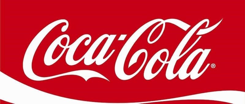
Brand Recognition and Recall: Consistent use of specific colours becomes a part of a brand’s identity. For instance, a brand like Coca-Cola is synonymous with the colour red, which is instantly recognisable and associated with the brand worldwide.
Emotional and Psychological Resonance: Colours evoke certain emotions and associations. A brand that uses a particular colour consistently in its products, like pen designs, communicates its brand values and personality. A brand that uses green extensively may be perceived as eco-friendly or natural, while blue might convey trustworthiness and professionalism.
Differentiating from Competitors: In a crowded market, colour can be a key differentiator. If competitors predominantly use conservative colours like black and blue, a brand that consistently uses bright, unconventional colours in its pen designs can stand out.
Colour Variety in Product Lines
Catering to Diverse Preferences: Offering a variety of colours within a single product line caters to different customer preferences, enhancing the product's appeal to a broader audience. This strategy acknowledges and celebrates individual tastes and personalities.
Seasonal and Trend-Based Colours: Brands can introduce seasonal colour variations or limited-edition colours based on current trends. This keeps the product line fresh and exciting, encouraging repeat purchases and collector interest.
Segmentation and Targeting: Different colours can target different segments of the market. For instance, a pen line featuring pastel colours might be targeted at a younger, more fashion-forward demographic, while a line with more subdued, classic colours might target professionals.
Mood and Occasion-Based Marketing: Colours can be matched with moods or occasions, like vibrant colours for festive seasons, soft hues for calm and relaxation-themed marketing, or bold colours for campaigns that focus on energy and action.
Implementing Colour Strategy in Pen Branding
Consistency Across Media: The chosen colours should be consistent across various marketing channels – from product design to packaging, advertising, and online presence. This creates a cohesive brand image that customers can easily identify.
Customer Feedback and Engagement: Brands can engage customers by seeking feedback on colour preferences or involving them in voting for new colours to be introduced. This not only increases engagement but also provides valuable insights into customer preferences.
Storytelling Through Colours: Colours can be used to tell a brand's story or highlight its history. Limited edition colours for anniversaries or special events can add depth to the brand narrative.
The Impact on Consumer Choice
The initial interaction a consumer has with a product is heavily influenced by its colour. This is particularly true for items like pens, where functionality is often assumed, and aesthetic appeal becomes a key differentiator.
Consumers often make subconscious judgments about products based on colour, which can influence their perception of the brand’s personality and the product’s quality. For example, a pen with a sleek black design may be perceived as more sophisticated, while a bright, colourful pen might be seen as fun and creative.
Colour and Perceived Value
Enhancing Perceived Quality: Certain colours can elevate a product’s perceived value. Metallic colours like silver or gold, for instance, can give pens a more premium look, thereby justifying a higher price point in the eyes of consumers.
Colour Preferences and Value Perception: Different target audiences may have varying colour preferences. A vibrant colour may appeal to a younger demographic, increasing the pen’s perceived value for that segment, while more subdued colours might appeal to a professional audience.
Colour in Driving Purchase Decisions
Emotional Resonance: Colours that resonate emotionally with consumers can be more persuasive in driving purchase decisions. For instance, a pen in a consumer’s favourite colour, or a colour that evokes a particular emotional response, is more likely to be chosen.
Colour and Purpose Alignment: The intended use of the pen can also influence colour choice. Bright and light colours might be more appealing for personal or casual use, whereas darker, more conventional colours might be preferred for business or formal contexts.
Colour and Brand Loyalty
Consistency in Colour Branding: When consumers associate a specific colour with a brand, consistent use of this colour can strengthen brand recognition and loyalty. For example, if a brand consistently uses green in its pen designs, consumers who have had a positive experience with the brand may be more likely to choose a green pen from the same brand in the future.
Limited Edition and Seasonal Colours: Introducing limited edition colours or seasonal variations can create excitement and anticipation among consumers, leading to increased engagement and purchases.
Cultural and Demographic Considerations
Cultural Significance of Colours: Colour preferences can vary significantly across cultures. Understanding these cultural nuances is crucial for brands operating in global markets to ensure that the colours used in pen branding align with the cultural sentiments and preferences of the target audience.
Age and Gender Preferences: Different age groups and genders may have distinct colour preferences. For instance, children and teenagers might prefer bright and bold colours, while adults may opt for more understated tones.
The strategic use of colour is a critical role in shaping consumer perceptions, enhancing the product’s appeal, and influencing purchase decisions. By understanding the psychological impact of colours, as well as cultural and demographic preferences, brands can make informed decisions in their colour choices, leading to increased consumer attraction, perceived value, and, ultimately, successful product sales.
Conclusion: Harnessing the Power of Colour in Pen Branding
In the competitive world of pen branding, understanding and leveraging the psychology of colour can give a brand a significant edge. By choosing colours that align with their brand identity and resonate with their target audience, companies can create ones that are powerful tools of expression and identity. As we continue to unravel the complexities of colour psychology, it becomes evident that the right colour choice can turn an ordinary pen into an extraordinary branding tool.
The Pens Only Team